
Een app die de verandering in levensverwachting vanuit verschillende perspectieven toont, gericht op landen
dash

NBA Clutch Shot performance voor dummies
Een one-page app die het concept Clutch Shot Performance in de NBA verduidelijkt.

Figure Friday 2025-w44
Billboard Hot 100

Figure Friday 2025-w40
Testresultaten rekenen/wiskunde NYC, grade 3 – grade 8

Figure Friday 2025-w38
Eindejaars top3 ATP ranglijst mannen tennis

Figure Friday 2025-w37
Fictieve sales dataset met wonderlijke transacties

Figure Friday 2025-w34
Montreal Metro Incidents 2019 (jan 1) -2025 (may 1)

Experiment 4 met #plotlystudio: opnieuw grafieken recreëren.
Blogs in deze serie zijn gebaseerd op de early access preview-versie van Plotly Studio. Plotly Studio is een AI-gedreven desktopapplicatie van Plotly, ontwikkeld om het bouwen van professionele data-apps en visualisaties te automatiseren.

Plotly Studio Experiment 3: Gekleurde oppervlaktegrafieken met AC vs PY omzet per medewerker
Blogs in deze serie zijn gebaseerd op de early access preview-versie van Plotly Studio. Plotly Studio is een AI-gestuurde desktopapplicatie van Plotly, ontwikkeld om het maken van professionele data-apps en visualisaties te automatiseren.

Plotly Studio experiment 2
Blogs in deze serie zijn gebaseerd op de early access preview-versie van Plotly Studio. Plotly Studio is een AI-gestuurde desktopapplicatie van Plotly, ontwikkeld om het maken van professionele data-apps en visualisaties te automatiseren.

Plotly Studio experiment 1
Blogs in deze serie zijn gebaseerd op de early access preview-versie van Plotly Studio. Plotly Studio is een AI-gestuurde desktopapplicatie van Plotly, ontwikkeld om het maken van professionele data-apps en visualisaties te automatiseren.

Maven Bookshelf challenge
Een app gebaseerd op data van Goodreads, boeken en reviews, waarmee mensen boeken kunnen zoeken en nieuwe boeken kunnen ontdekken.

Figure Friday 2025-w28
Corruption Perception Index (CPI): vergelijk regio’s en landen

Figure Friday 2025-w23
Hoeveel slechte gewoonten houden mensen erop na.

Figure Friday 2025-w22
Marvel films, verhouding tussen wereldwijde inkomsten en budget, een AI Claude-experiment.

Figure Friday 2025-w21
CO2 emissiecijfers per land, per periode.

Figure Friday 2025-w20
Dammen in de USA: is er een actieplan voor dammen waarbij een ongeluk grote gevolgen kan hebben.

Figure Friday 2025-w19
Inzicht in het proces (deelnemers en afvallers) om een TLC rijbewijs te krijgen. Een TLC rijbewijs is een rijbewijs dat je in de USA toestemming geeft voor speciaal vervoer.

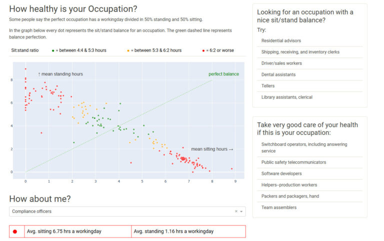
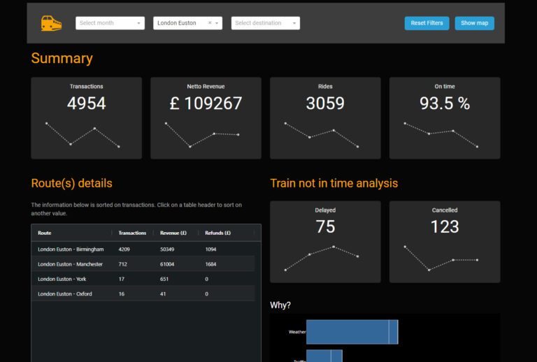
Figure Friday 2025-w17
Emigratie en immigratie beweging per land, per jaar in de periode 1990-2024. De app geeft inzicht in land van herkomst of bestemming wat betreft inkomensclassificatie volgens de wereld bank.

Figure Friday 2025-w16
Een visualisatie die het percentage huishoudens in een continent of land toont, met een bepaald huisdier.

Figure Friday 2025-w15
Een app die het op basis van marketingcijfers mogelijk maakt om de “range” van verschillende elektrische auto’s met elkaar te vergelijken. Je kunt kiezen voor een verzameling Nederlandse of wereldwijde steden als uitvalsbasis.

Figure Friday 2025-w14
Een app die het mogelijk maakt om de tijden van de winnaars in verschillende roeicategorieen met elkaar te vergelijken. Daarnaast is het ook mogelijk om de winnaarstijden per jaar te vergelijken met een heatmap met temperatuur, regen en/of wind omstandigheden.
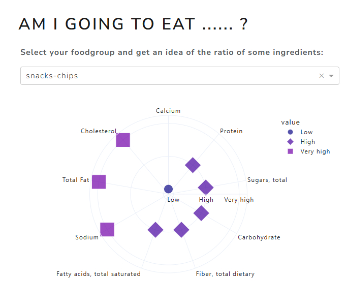
Figure Friday 2025-w13
De app geeft je een inzicht in de samenstelling van voedsel binnen een bepaalde voedselgroep, als het gaat om stoffen zoals cholesterol, suiker en meer.

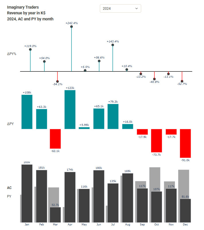
IBCS experiment 3
Maandomzet per medewerker in overzicht met vergelijking zelfde periode vorig jaar.

Maven Pixar Challenge
Pixar door de jaren, inzichten en een verhaal over 30 jaar Pixar films.
IBCS experiment 2
Jaaromzet, vergelijk met vorig jaar in $ en %


IBCS experiment 1
Actuele omzet en omzet vorige maand in $ en % op 1 scherm.


Global sentiment analysis of my most recent tweets
Edit 7 jan. 2025, since Twitter got a new owner, this stopped working. Last Monday, I read a post on LinkedIn that said participating in data challenges is not the way to build your portfolio. I don’t quite agree with that. My father used to hurl “üben, üben, üben” (German, it means exercise a lot, by the way I am Dutch) at my head and every challenge is an exercise, if only in patience. I decided to answer the question “suppose a machine investigates whether I am a bit positive on Twitter, what would the result be“. I went for a Sentiment Analysis.
Globale sentimentanalyse van mijn tweets
Afgelopen maandag las ik een post op LinkedIn waarin stond dat meedoen aan data challenges niet de manier is om je portfolio op te bouwen. Daar ben ik het niet helemaal mee eens. Mijn vader slingerde regelmatig “üben, üben, üben” naar mijn hoofd en elke challenge is een oefening, al is het maar in geduld. Maar goed, iets anders dus. Ik besloot de vraag “stel dat een machine onderzoekt of ik wel een beetje positief ben op twitter door daar een sentiment analyse op los te laten” te beantwoorden. Mijn eigen analyse die mijn tweets indeelt in positief, negatief en neutraal moest het antwoord op de vraag geven.