To get more experience with python I decided to recreate a dashboard I saw online. You can filter and select the data to download, I used the most recent data (2019). On the Visualisations tab (using the WHO link above) you can find the dashboard I tried to make (the second visualisation).
About the data
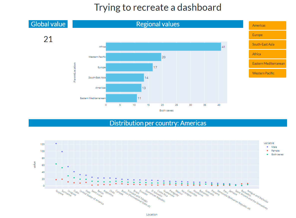
I should have known better and should have read the Metadata. The data is delivered with factnumbers for age-groups. And when I look at my result and compare it to the original, the first thing that comes to mind is “there must be a weighting factor for the age-groups on a continent or even a country”. The lineplot order is relatively ok, but the summaries are not at all, not even the order. Learning point: don’t ever do this again this way.
The result
Code and used dataset are on github. I could do more finishing this dashboard but the datathing made me decide to stop this exercise. My Dash dashboard in action:
“