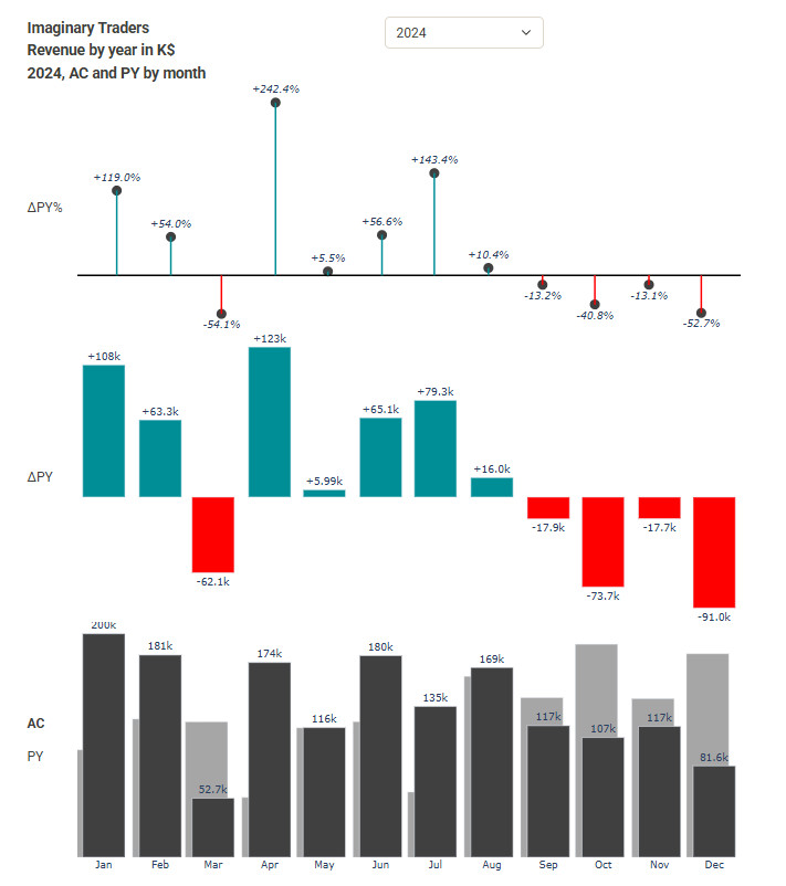
Annual revenue, compared with last year in $ and %
Experiment Objective
In Power BI, extensions like Zebra make it easier to create dashboards and reports following IBCS standards. I wondered how difficult it would be to recreate some of those “visuals” using Dash/Plotly. I did not research whether there are libraries available for this tech stack that could simplify the task. Another goal was to create something with a predefined visual structure rather than something I could design freely. This approach inevitably leads to exploring the limits of the available tools.
Demo topic annual revenue:
- Comparison with last year ($ py)
- Comparison with last year in % (% py)
Note: the data for the first year (2022) in this visualization was generated by ChatGPT. It was in an optimistic mood regarding the revenue for 2022.
Demo includes
- Fixed zero line for all ΔPY values. This means that the zero line will remain stable and won’t shift when selecting a different year with different values.
- Last year’s revenue is neatly displayed as a bar behind the current year. That was a bit tricky to achieve in Dash/Plotly.
IBCS stands for International Business Communication Standards and provides practical guidelines for consistently designing reports, visuals, and dashboards to enhance clarity and understanding.