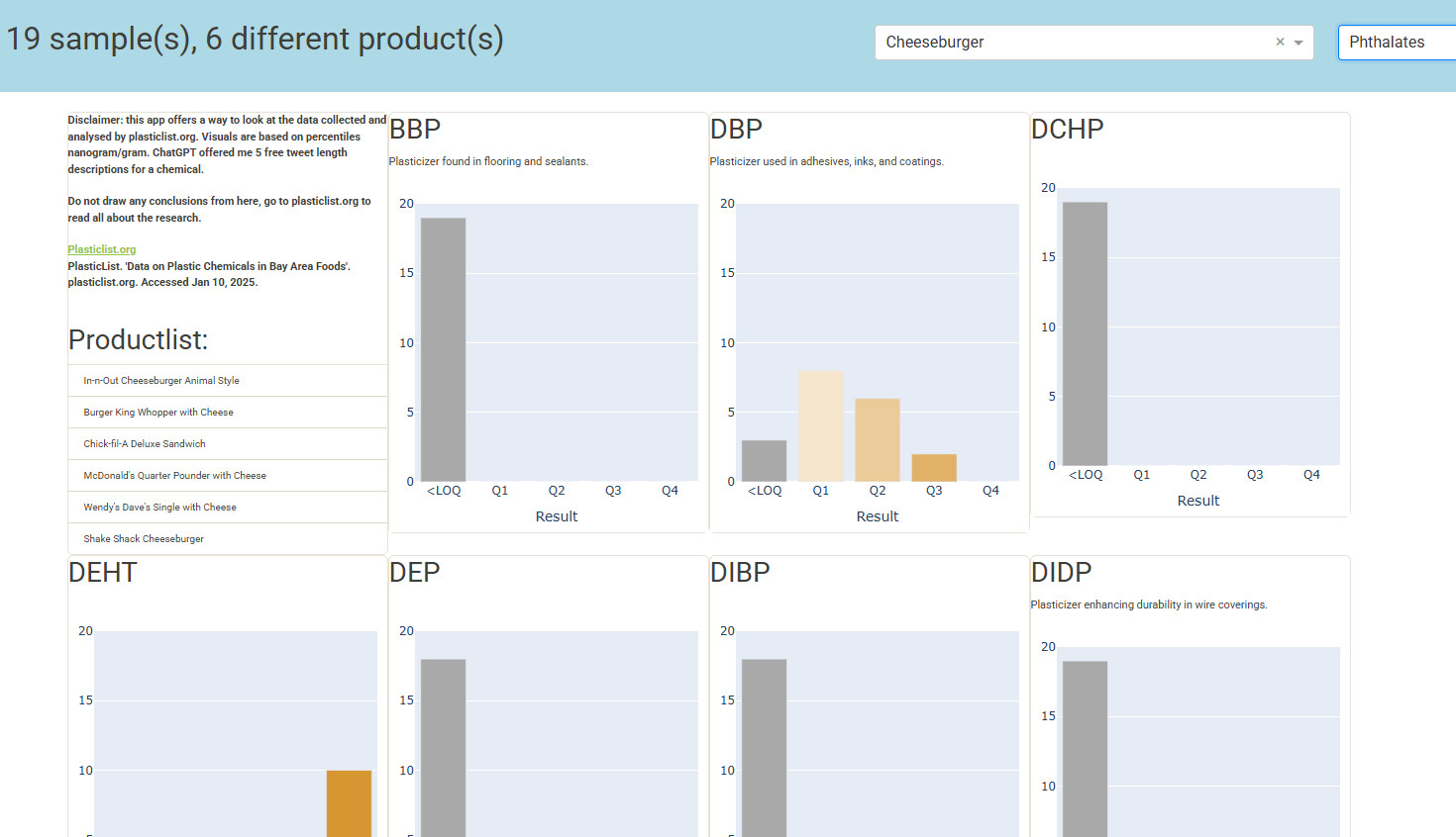
This week’s Figure Friday focused on research into plastic traces in food in and around the San Francisco Bay Area. The study examined 18 substances across 600+ samples.
This dashboard aims to make the results more accessible but is intentionally vague to prevent misleading conclusions. I left it at that—this isn’t my area of expertise. The dashboard’s design isn’t perfect, but if you’re interested in this topic, visit Plasticlist.org for a full explanation of the research.
PlasticList. ‘Data on Plastic Chemicals in Bay Area Foods’. plasticlist.org. Accessed Jan 10, 2025.
Voorbeeld bevat
A grid layout featuring cards, where the first card is fixed and contains:
- A disclaimer
- General information
- A product list
Figure Friday is an initiative from the Dash/Plotly community. Every friday a new dataset is made available with some basic code to show a visual and an explanation of the subject. People are invited to adjust the code and improve the visual or create a small app. The next friday a zoom session takes place where some explain why they made what they made and others can give feedback, all in a constructive and respectful atmosphere. In the thread on the community site people share their visual, code and a demo if possible.