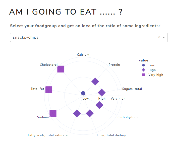
The app gives you insight into the composition of food within a certain food group, when it comes to substances such as cholesterol, sugar and more.
This week’s Figure Friday highlights data from a study on the composition of approximately 50,000 supermarket products. For each specific substance or vitamin, a numerical value represents the amount present in the product.
Example includes
- Scatter Polar Chart
- Relative Presence Categories: I categorized substance presence into five levels—“very high,” “high,” “average,” “low,” and “very low”—to create a more neutral comparison across product groups. Later, through the work of others, I discovered several less labor-intensive methods and libraries that could have simplified this process. That’s why Figure Friday is so much fun.
Figure Friday is an initiative from the Dash/Plotly community. Every friday a new dataset is made available with some basic code to show a visual and an explanation of the subject. People are invited to adjust the code and improve the visual or create a small app. The next friday a zoom session takes place where some explain why they made what they made and others can give feedback, all in a constructive and respectful atmosphere. In the thread on the community site people share their visual, code and a demo if possible.