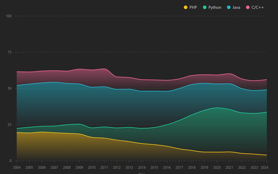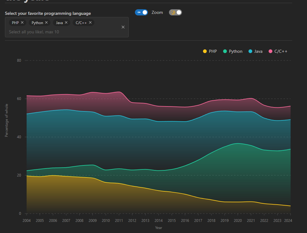
The topic of this Figure Friday is the usage statistics of approximately 30 programming languages from 2004 to 2024.
The data is presented as percentages, totaling 100% per year when all programming languages are selected. For this Figure Friday, I experimented with Dash Mantine instead of Dash, Plotly, and Bootstrap.
Example Includes
- Stacked Area Chart
- Multiselect: Allows selection of up to 10 programming languages in the visualization.
- Dark/Light Mode Toggle
- Zoom Level Toggle: When selecting a language like Kotlin, a line appears on a scale from 0 to 100%. The zoom level toggle enables zooming in on Kotlin’s usage trend by adjusting the y-axis.
Embed py.cafe in your wordpress site
Not all dashboards are suitable to embed on a wordpress page, but this figure friday small app is. It even responds to scaling of your screen.
Figure Friday is an initiative from the Dash/Plotly community. Every friday a new dataset is made available with some basic code to show a visual and an explanation of the subject. People are invited to adjust the code and improve the visual or create a small app. The next friday a zoom session takes place where some explain why they made what they made and others can give feedback, all in a constructive and respectful atmosphere. In the thread on the community site people share their visual, code and a demo if possible.